Wednesday, February 28, 2018

2 player Dungeon: The Temple of Khabuugan the Terrible


"There are only two of them? What sort of adventuring party is that?"
"I count three, Kovath."
"The hireling doesn't count."
"How do you know he's a hireling?"
"He's got that lean, hungry, I'm-not-being-paid-nearly-enough-for-this look about him."
"And what is he not being paid enough for?"
"That depends."
"On what?"
"Whether or not the bears wander into the garbage smasher while the adventurers are getting cut to pieces by the Watcher at the End of Time."
A little while ago I realized I'm so far behind on session recaps that if I don't get help I'll never get caught up.  I asked my players if they would mind doing some of the writing for session recaps and Kalzazz offered to step up for the group he's in with Stripe.   The 2 player dynamic was very interesting to me and the fact that the dungeon spit out fights that they could win just based on their CER was very encouraging to me.  The campaign looked like it was going to be pretty silly in tone from both the characters I received at the outset, so I decided to roll with it and named their 62 point hireling Healbot.

Iginio is perhaps the most optimized 250 point character I've ever seen in terms of never missing a turn to do very respectable damage.  Kalzazz plays Fiona in the larger group and expressed some frustration at not being able to make some sort of attack every turn.  Colarmel created a character tailor made for Kalzazz's concerns.  He swings his katana for 3d+8 (and has reach 2 doing it) and when he can't close, he can chuck a sai for 2d+3 imp which is pretty respectable as a main weapon, much less a fast-drawable ranged secondary attack.

Strudelbork is a fantastic support wizard, and is capable of some significant buffs (Great haste) as well as inflicting some major ailments on foes (strike blind, death vision, glue).  His standard operating procedure of staying levitated outside of normal melee reach makes him a tough one to pin down in a fight while providing fantastic support.

Without further ado here is Kalzazz's recap of events from the first 2 player session of DoA  (The session log for this recap is available here)

The Temple of Khabuugan the Terrible session log


This is a session log of a session recap located here.
 

Tuesday, February 27, 2018

Token Tuesday: Troll

Today on Token Tuesday, Emily Smirle has served up for you an assortment of trolls.  The tokens are released to you under Creative Commons.  Below is a preview of one unbased version, if you follow the link here you can get a zip file with both the based and unbased versions of these creatures.

Thursday, February 22, 2018

5 Player Group: The Dark Shrine of Ruin Part 1: Throttlers and a Troll

"Wait, what's that one doing?"
"Sneaking ahead."
"Why?""Because he doesn't know the throttlers are there."
"Wow. He's gonna get cheesed.""Cheesed, Kovath?"
"Cheesed. It's like creamed, but it takes longer and you come out in chunks."
"...yep, he's gonna get cheesed." (Hat tip to Sir Terry Pratchett)

 We started a new dungeon called the Dark Shrine of Ruin.  I'll post the map and settings to generate it after my players clear it.  The log for these two sessions is found here.

Session Log Dark Shrine of Ruin 1

This is a session log for the first two sessions of Dark Shrine of Ruin.  An easier to read recap is located here.

Wednesday, February 21, 2018

GM tips: Monster Traits part 1

Make sure your players are using the right tools for your monster's traits!
Image by Scotimus licensed under Creative Commons

"Kovath."
"Hm?"
"What has six arms, spits poison, and can't be killed unless you chop off its tail?"
"I don't know, but if she's looking for a job she's hired."

If you are like me, you start looking at a monster from the top of the stat block on down.  You take note of the monster's ST and HP and work your way down the list from there.  I'd like to suggest something new: Start with the traits section.

Why the traits section?  Simply put, those traits are the biggest thing that makes a monster unique.  More than once after getting half way (or all the way) through a fight I realize that a monster should have behaved differently due to a trait.  Let's take a moment to look at a few major traits it's easy to overlook that completely change the threat level and behavior of a monster.

Tuesday, February 20, 2018

Token Tuesday: Minotaur

Today on Token Tuesday, Emily Smirle has served up for you the Minotaur.  The tokens are released to you under Creative Commons.  Below is a preview the unbased version, if you follow the link here you can get a zip file with both the based and unbased versions of this creature.

Tuesday, February 13, 2018

Token Tuesday: Giant Spiders

Today on Token Tuesday, Emily Smirle has served up for you the Giant Spiders of various sizes.  DFRPG lists 3 sizes of Giant Spiders that we're covering today: Big, Huge and Humongous.  The tokens are released to you under Creative Commons.  Below is a preview the unbased version, if you follow the link here you can get a zip file with both the based and unbased versions of these creatures.


Creative Commons LicenseSpider Tokens by Emily Smirle is licensed under a Creative Commons Attribution-NonCommercial-ShareAlike 4.0 International License.

Tuesday, February 6, 2018

Token Tuesday: Apes

Today on Token Tuesday, Emily Smirle has served up for you the Apes of various sizes.  DFRPG lists several unarmed Apes that we're covering today: The Flesh Eating Ape, The Giant Ape and the Giant Ape's bigger incarnation, the Silverback.  The tokens are released to you under Creative Commons.  Below is a preview the unbased version, if you follow the link here you can get a zip file with both the based and unbased versions of these creatures.


Creative Commons LicenseApe Tokens by Emily Smirle is licensed under a Creative Commons Attribution-NonCommercial-ShareAlike 4.0 International License.

Friday, February 2, 2018

Making the dungeon prettier

"Oh look. Another plain, featureless stone wall and plain, featureless stone floor with a plain, featureless stone ceiling. I absolutely love the way these dungeons look, Kovath. The constant sameness isn't at all boring or monotonous."

"I'm glad you lik-- wait, from your tone that was sarcasm. What's your problem now?"

"Well, can't we - I don't know - spruce things up a little? A mosaic here, some rough-hewn stone there, maybe some cave paintings?"

"I am not letting you hang Zarlazz Junior's fingerpainting in our dungeon. This is procedural generation, not arts and crafts with Miss Nuggurath."

"Look, just because you don't have a family doesn't mean you should --"

"Okay, okay. We can make the dungeon 'prettier' if you insist."
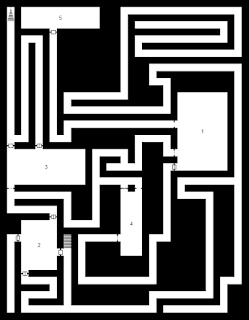
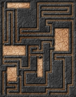
 I've started doing a pretty simple thing to up my map game. It allows us to go from plain black and white maps to something a little more visually interesting.
Before
After


  1. Generate a dungeon that looks good to you and click the Save as PNG button and save the resulting file somewhere you can find easily;
  2. Open the file you created in step one in Gimp;
  3. Select the Select by Color tool in the top right of the toolbox inside GIMP;
  4. select any white space on the dungeon map;
  5. press delete on your keyboard.  The map should now look like this:
  6. Take the eraser tool and remove all the doors, portcullises and secret doors from the dungeon.  (One day you'll be able to skip this step once we get player maps implemented);
  7. Click Filters then select Dungeon Map Maker in the dropdown;
  8. In the new window that opens up, you'll have lots of options to play with.  For now, we'll keep it pretty simple.  If you intend to use these in a VTT like Maptool, Fantasy Grounds or Roll20, You'll want to skip adding a grid here, and let that software provide the hex grid;
  9. Change the Template Color to Black by clicking on the white color swatch, then clicking and dragging anywhere in the color window up to the top left corner;
  10. Change Template Colour Identifies to Walls;
  11. Change Fill Floor With to Pattern - Select Below  (we could change the pattern, but the default one is neat for this tutorial);
  12. Click OK;
  13. After the filter does it's magic, click File then export and save it somewhere.  Isn't she lovely?
The resulting map is way prettier than anything the generator will kick out on it's own.  From there, you can add in a few objects and doors found online for something really awesome.  The techniques are useful even if you want to hand draw a black and white map then spice it up a bit.
Feel free to share map making tips in the comments!